 Heineken is not only a great consumer brand but a corporate overseer of more than 250 beer and cider brands. In this age of brand awareness Heineken has opted for brand differentiation. As a brewer, HEINEKEN is a brand. As a brand, Heineken is a world reknowned beer. They have chosen to differentiate the corporate visual identity from the product visual identity.
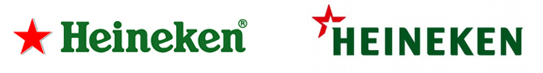
The re-designed HEINEKEN corporate name appears in all caps with a red star, which they call a spark, purportedly representing the spirit and energy of the company’s more than 70,000 employees worldwide.  For me, the spark bares somewhat of a resemblance to the Texaco star.
The visual identity and design of the iconic Heineken beer brand remains unchanged. The Heineken beer typeface used in upper/lower case is more friendly as a consumer brand, like beer, should be. The all caps corporate version is a bit rigid but strong and iconic.
I understand the brand awareness reasoning for this change but it will certainly cause visual brand confusion with two visual variations on the Heineken/HEINEKEN word. At first glance, consumers may jump to various inaccurate conclusions. If HEINEKEN integrates the corporate icon onto the product, it must be done with great finesse and respect for the consumer brand.
 Coca-Cola company uses one visual brand for its signature product and its corporate icon and I believe it works. I think the same could apply for Heineken. Stay with one consistent visual brand identity for their signature product and their corporate entity. It makes everything that much more powerful.

In Coca-Cola’s corporate visual identity usage, they add “The”before and “Company” after the iconic brand name. This works. It makes the connection on all levels. It is a strong brand because of many reasons but one of lesser importance, there is no question and no confusion as to who the company is and who the brand is. Coca-Cola has many product brands but there is no doubt, its signature brand is its strongest. And the same can be said for Heineken.
