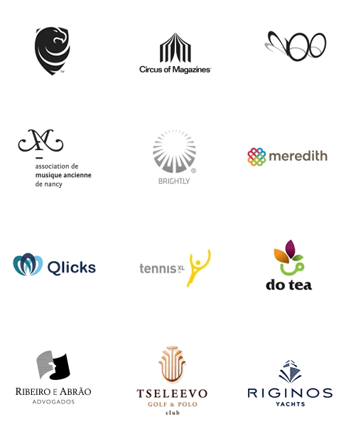
The Worldwide Logo Design Annual (WOLDA) showcases the 2009 edition which includes 192 logo winners selected from nearly 2000 entries. See a few I have chosen to display below.
These are all really great logos. Why?
Here is a quick litmus test for a good logo.
Is it simple?
Will it work in black & white as well as color? Simplicity builds recognition. Simple shapes are more easily identified.
Is it memorable?
Does it stimulate recall? Does it facilitate recognition?
Is it significant?
Does it use positive and negative space effectively and meaningfully.
Is it appropriate?
Does the visual representation have meaning and significance to your company? Does it convey a high degree of professionalism and the appropriate personality?
The vision behind the visual speaks volumes about the company.
As said by Paul Rand, “A logo derives its meaning and usefulness from the quality of that which it symbolizes.”
Is it distinctive and original?
Does it differentiate you from your competitors? Does the color evoke emotion by communicating certain attributes? Does it attract attention?
Is it versatile?
Is it adaptable to all graphic media? Does it work well large in size as well as small?
Will it work well on a business card as well as a billboard?
Check yours and see how it holds up to these 6 attributes. Could it communicate better?
Trackbacks & Pingbacks
[…] Read “What Makes A Really Good Logo.” […]
[…] This post was mentioned on Twitter by . said: […]
Comments are closed.