
How do we get your customers to pay attention to your message?
As designers, we strive to lead viewers attention through your important communications by using …
• contrasting size (scale), color, and page position.
• large, bold display type and/or graphics to direct them.
• varying visual weight, intensity, and color, applying appropriate focus.
We like to make it easy for viewers to read,
so we organize elements using …
• a grid system to arrange elements coherently in the space.
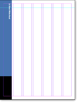
• multiple columns to help place text and visuals into smaller, more easily taken in bytes of information- such as, text divided into two or three equal columns. Text the full width of the page loses a reader. Optimal reading line width has a standard ratio that is relative to the overall width of the page. A single wider column with a smaller column for pullout quotes and other types of supporting content also works well.
• left aligned (unjustified) text to create visual relief while managing the “rag” or sentence breaks.

• increase leading (white space between lines) to lighten the look of the page.
White space…. Yes! It has a purpose!
White space helps differentiate the different elements in the space and gives the readers eyes a break. It is a fine balance. Too much material and the page will appear cluttered and viewers eyes are confused as to where to go. Too much white space and the page will appear empty, again confusing our viewers. But it is better to have too much white space than not enough.
We use white space when …
• we want two elements to look distinct, using the appropriate white space between them provides focus.
• an element needs to be highlighted, increasing the amount of white space around it draws attention.
• optically balancing the space – leaving a little more white space at the bottom of a page relative to the top of the page and nice margins on left and right so nothing appears crammed on the page.
• we create a wide margin with the purpose of directing the viewer’s attention into the copy or image area.
Our goal with visual communications is to invite the reader into the page and have them leave with your message.
