IHOP has a new logo — their first redesign in over 20 years.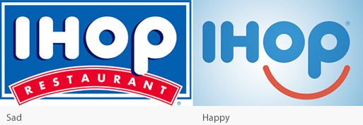
IHOP’s Vice President of Marketing, Kirk Thompson, told BuzzFeed News that the old logo’s red banner “appeared as a person’s frown”. That kind of negative attitude, he said is just “not in concert with guests expectations.”
Kudos to Kirk Thompson! He knows his brand marketing.
Logos using a smile make a positive emotional connection and isn’t that what we all strive for?
This is Design 101. See Happy Logos! Always avoid using an arc that represents a frown. It sends a subliminal negative message to your audience. So “turn that frown upside down” is a wise and astute observation!
The official press release states that “the logo launch will be celebrated with a series of “Summer of Smiles” activities devoted to those who, through service and other programs, help people smile.”
There are just so many places this visual brand can go. The possibilities are endless, all based on the brand concept of making people happy. It’s a win-win. Congratulations IHOP. Now, that’s great branding!
We are all getting better and better at noticing and building powerful visuals that are consistent with our brands… and it makes me smile!
